The GGPoker app is getting a facelift!

Out with the old, in with the new!
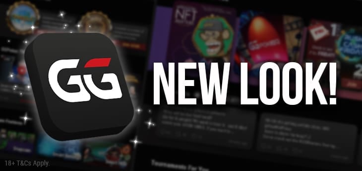
Our GGPoker app user interface is getting an improvement in the coming days, and we’d like to share what’s in store. The current ‘Discover’ section on the app’s homescreen, which displays banners and posters of upcoming promotions, tournament series, game features and more, has been totally redesigned.
The new look has been carefully designed, with an emphasis on clean, symmetrical lines. Our latest tweets and GGPoker.TV will be displayed, allowing you to find out the latest news and catch the best action there is, without having to switch between app and browser.
They say a picture paints a thousand words, so don’t just imagine what the change will look like; firstly, here’s the new (displayed in max mode):

And for comparison, here’s the old:

We hope you like the change! As always, there will be more improvements on the way in the future; GGPoker has the very best software in the poker world, and we plan to keep it that way.
